How to Crop Images in CSS Using object-fit to Preserve Aspect Ratio

John on August 30, 2020

There are some scenarios when you need an image to be a fixed width and height that is different from its original size. If you just set a width and height using CSS it will stretch the image and ruin the aspect ratio.
The best way to make an image fit into a fixed area is by cropping it using the CSS3 object-fit property.
object-fit Values
contain- resizes the image based on its largest dimensioncover- makes the image fill the area by covering the largest dimension equally on either sidefill- just fill the width and height and stretch image if needednone- keep the original size but only show inside the width/height areascale-down- scale down by the widest sideinitial- default - has no effect on the imageinherit- inherit the value from a previous CSS propertyunset- remove the effect ofobject-fit
Before using the examples below you will need to have a class on your HTML image element and a width and height set. Width and height can be defined from within the HTML or CSS.
<img src="tower-bridge.jpg" width="400" height="400" alt="example" class="example">
or with CSS:
.example {
  width: 400px;
  height: 400px;
}
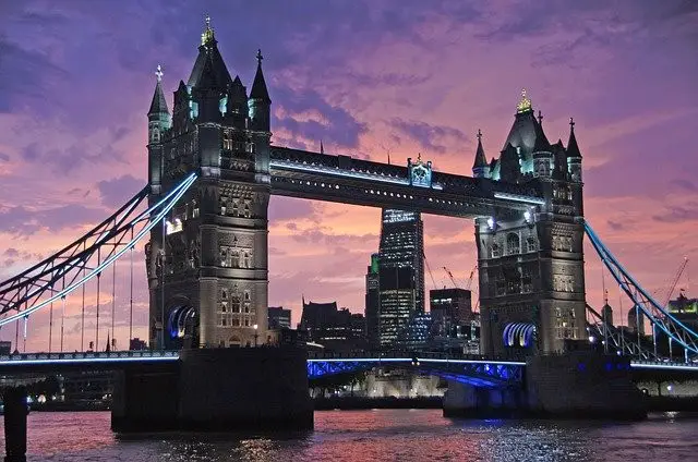
Let's go through each object-fit value and see how they affect an image. The original image is 640w x 424h and is set to 400px x 300px.
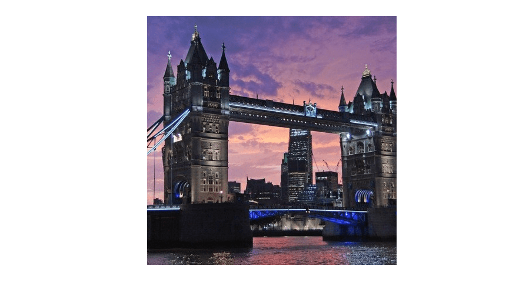
Original image
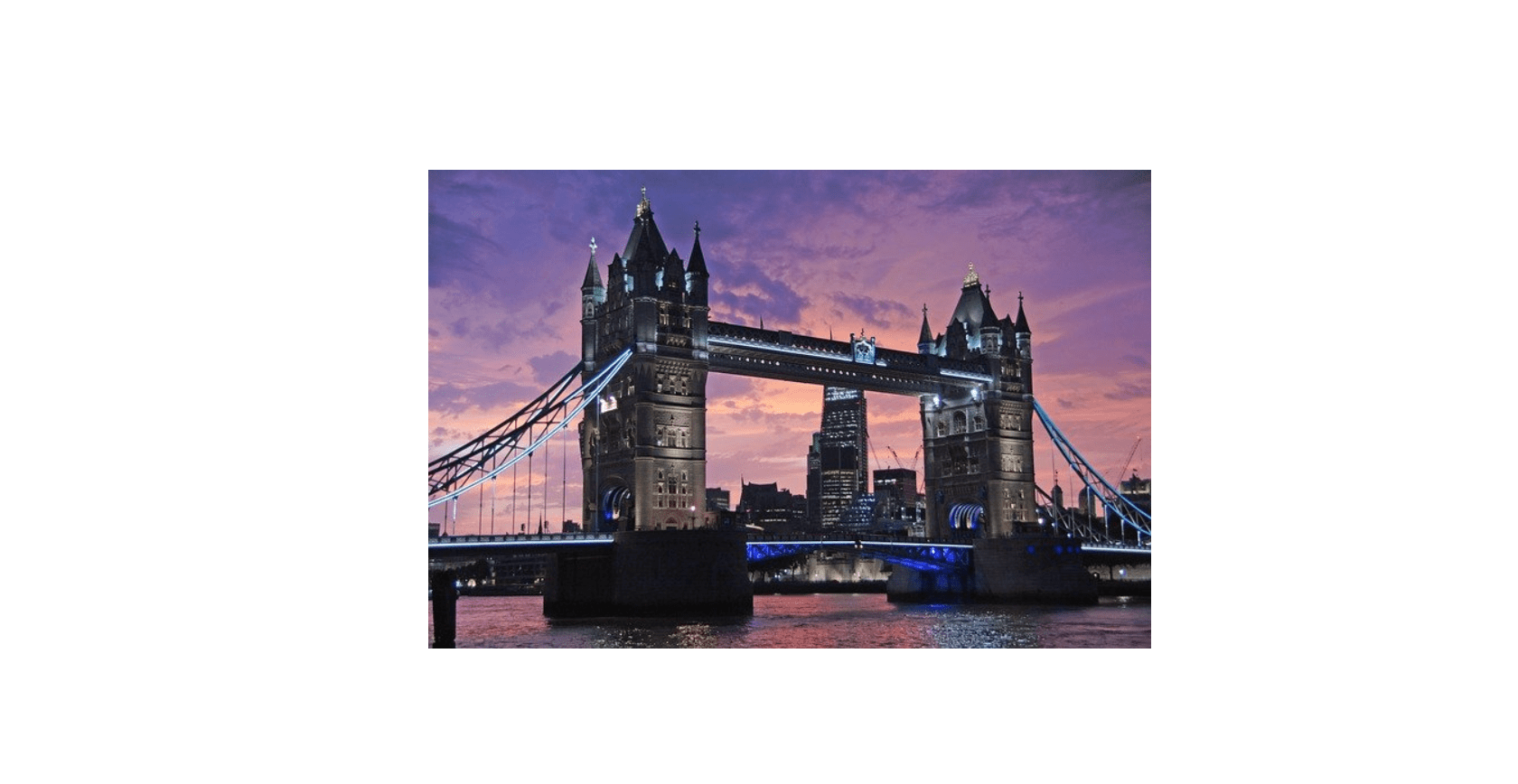
Without object-fit
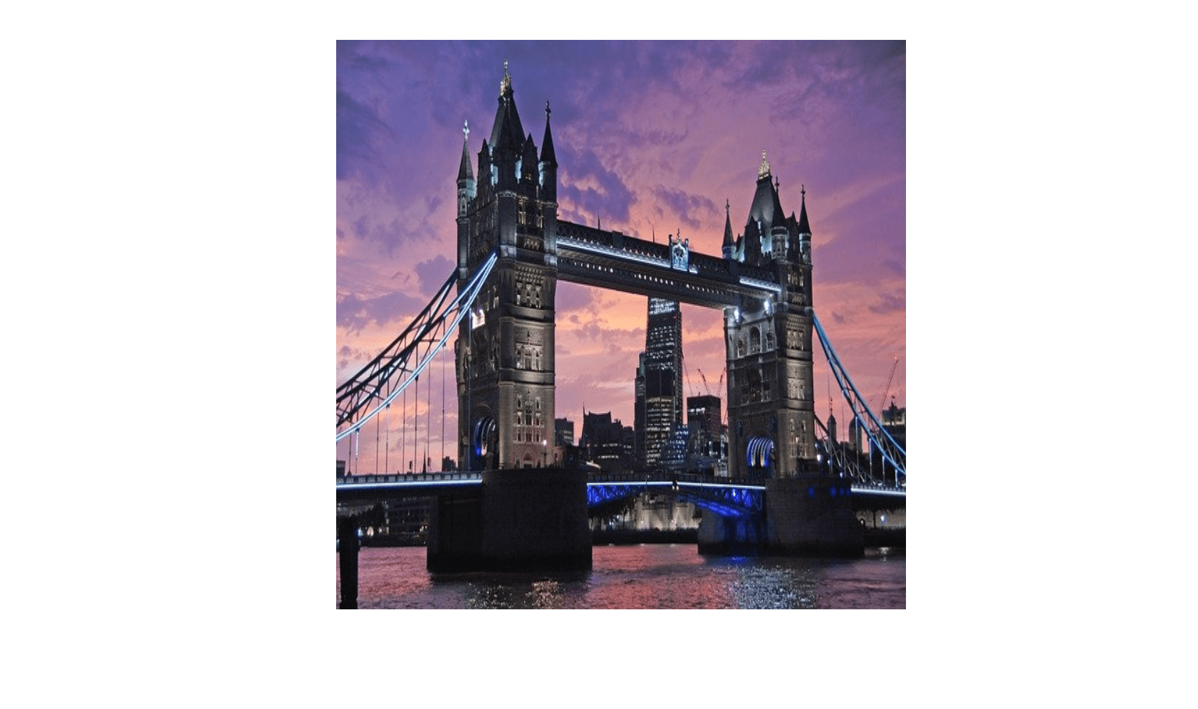
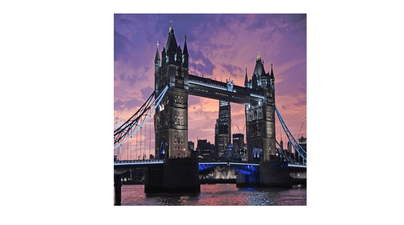
object-fit: contain;
.example {
  object-fit: contain;
}
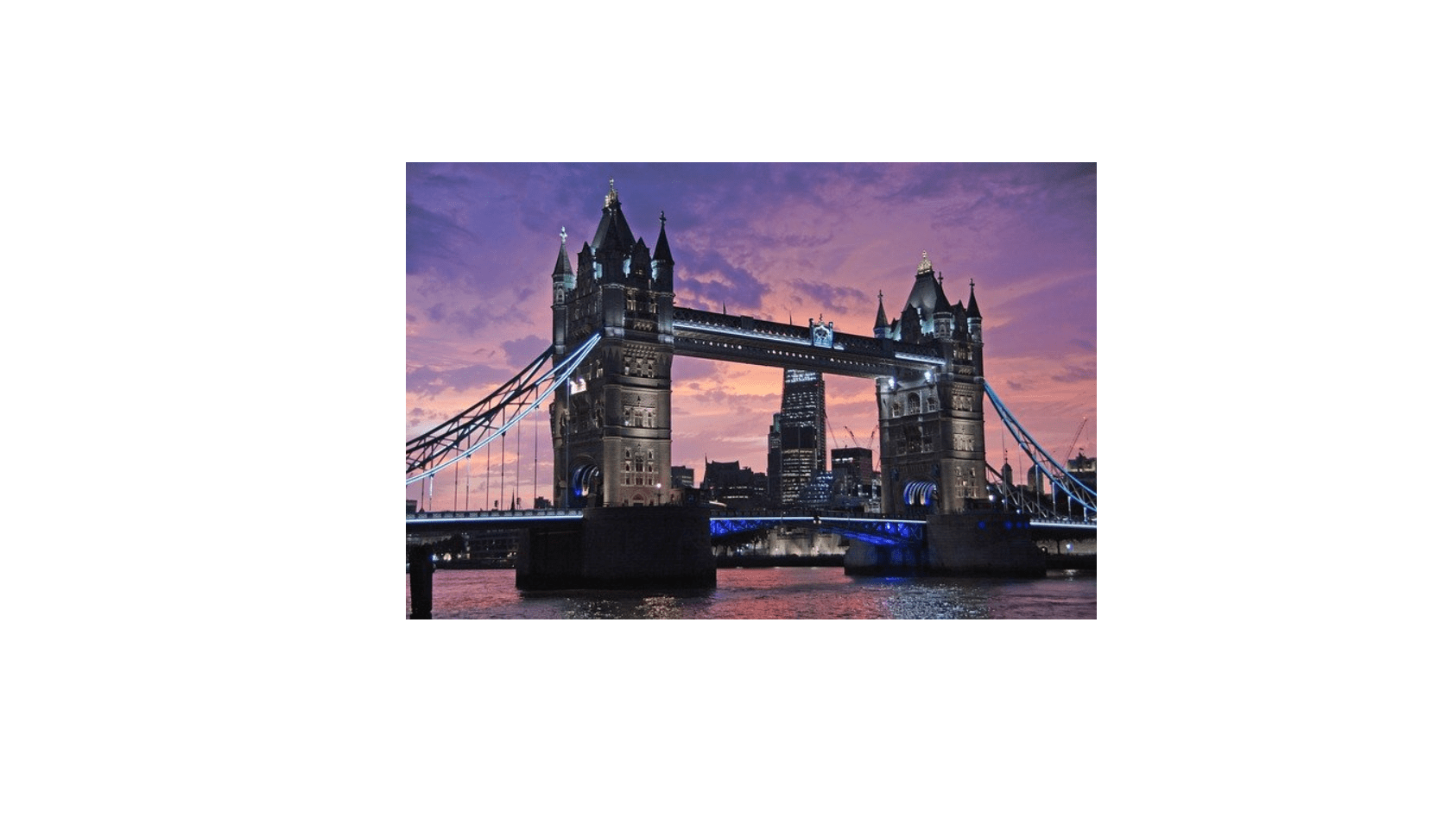
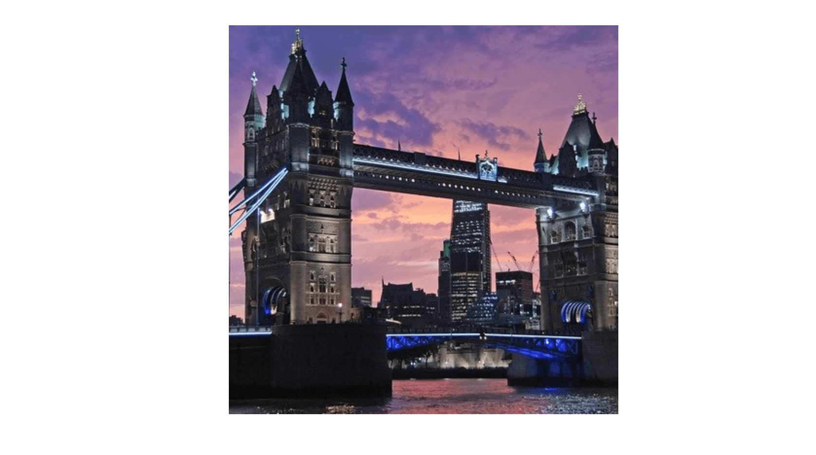
object-fit: cover;
.example {
  object-fit: cover;
}
object-fit: fill;
.example {
  object-fit: fill;
}
object-fit: none;
.example {
  object-fit: none;
}
object-fit: scale-down;
.example {
  object-fit: scale-down;
}
How to Use object-position To Position Image
Let's say you have the value of object-fit set to cover and your image has been cropped but you don't like the position of the crop. You can use the object-position CSS3 property to change this.
The first value is the X axis (horizontal) and the second is the Y axis (vertical). In the example below we are showing the right-hand side of the image first:
object-position: 100% 0;
You can use left, right, bottom and top as well as px (pixel) and % (percent) values:
object-position: left bottom;
Conclusion
You now know how to use the object-fit CSS3 property to preserve the aspect ratio of images and what behaviour each of its values has.